Margins and Gutters: Spacing That Brings Your Grid to Life
When it comes to grid-based design, margins and gutters are often the unsung heroes. While columns define where your content sits, margins and gutters define how your content breathes and interacts within that space. They create the invisible structure that guides the eye and helps users understand the hierarchy and flow of information.
Understanding how to size and justify these values is a key part of designing flexible, readable layouts, especially when you’re building across multiple screen sizes. “Eyeballing it” won’t cut it when a stakeholder asks why your spacing feels off. You should be able to explain why you chose the numbers you did, and that’s what this post is all about.
What Are Margins and Gutters?
Gutters are the spaces between columns. They keep content from feeling cramped and ensure text and images don’t run into each other. Margins are the space on the outer edges of the grid. They keep content from hugging the edges of the screen and give your layout room to breathe.
Both elements affect the total width of your grid and need to be considered when defining your column structure.
Why You Can’t Just Guess
Let’s say you’ve decided to use a 12-column grid. You still need to determine:
-
How wide each column should be
-
How much space sits between each column (gutters)
-
How much space sits on either edge (margins)
Without a plan, this gets messy fast. Gutters that are too wide waste space. Margins that are too narrow make the layout feel cramped. Worse, your design might look fine at one screen size but fall apart at others.
That’s why we use math—not just instinct—to get it right.
How to Calculate Margins and Gutters
Let’s walk through a simple example on a desktop layout that’s 1200px wide.
Say you want:
-
12 columns
-
16px gutters (between columns)
-
Equal left and right margins
Here’s how we calculate everything.
-
Start with the total width of your layout:
1200px -
Account for the space taken up by gutters:
You’ll have 11 gutters in a 12-column grid.
11 gutters × 16px = 176px -
Subtract the gutter space from the total width:
1200px - 176px = 1024px -
Divide the remaining space by the number of columns to get column width:
1024px ÷ 12 = ~85.33px per column
Now you know:
-
Your grid has 12 columns, each approximately 85.33px wide.
-
16px gutters between them
If your grid is centered, the margins fall outside the column + gutter structure and will vary depending on how you’ve aligned the grid on your canvas (more on that below).
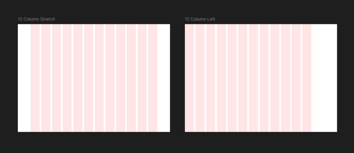
How Alignment Affects Margins
Let’s say you want your grid to be left-aligned instead of centered.
-
You still calculate columns and gutters the same way.
-
The left margin might be fixed (e.g., 24px), while the right margin absorbs the remaining space.
That’s why it's so important to start by defining your alignment and then build your margins and gutters around that decision. A centered grid requires equal margins. A left-aligned grid may have asymmetrical margins.
Quick Tips
-
Always subtract total gutter width before dividing by the number of columns.
-
Use consistent gutter sizes across breakpoints if possible.
-
Margins can scale more than gutters. It’s common to increase margins on large screens but keep gutters the same.
Final Thought
Margins and gutters aren’t an afterthought. They’re the glue that holds your layout together and can dramatically change how clean, readable, and balanced your design feels. When you understand how to calculate and justify them, you’re no longer guessing; you’re designing with intent.
Visual reference for the grid calculations above:
Comments
Post a Comment